What is the best font for a website?
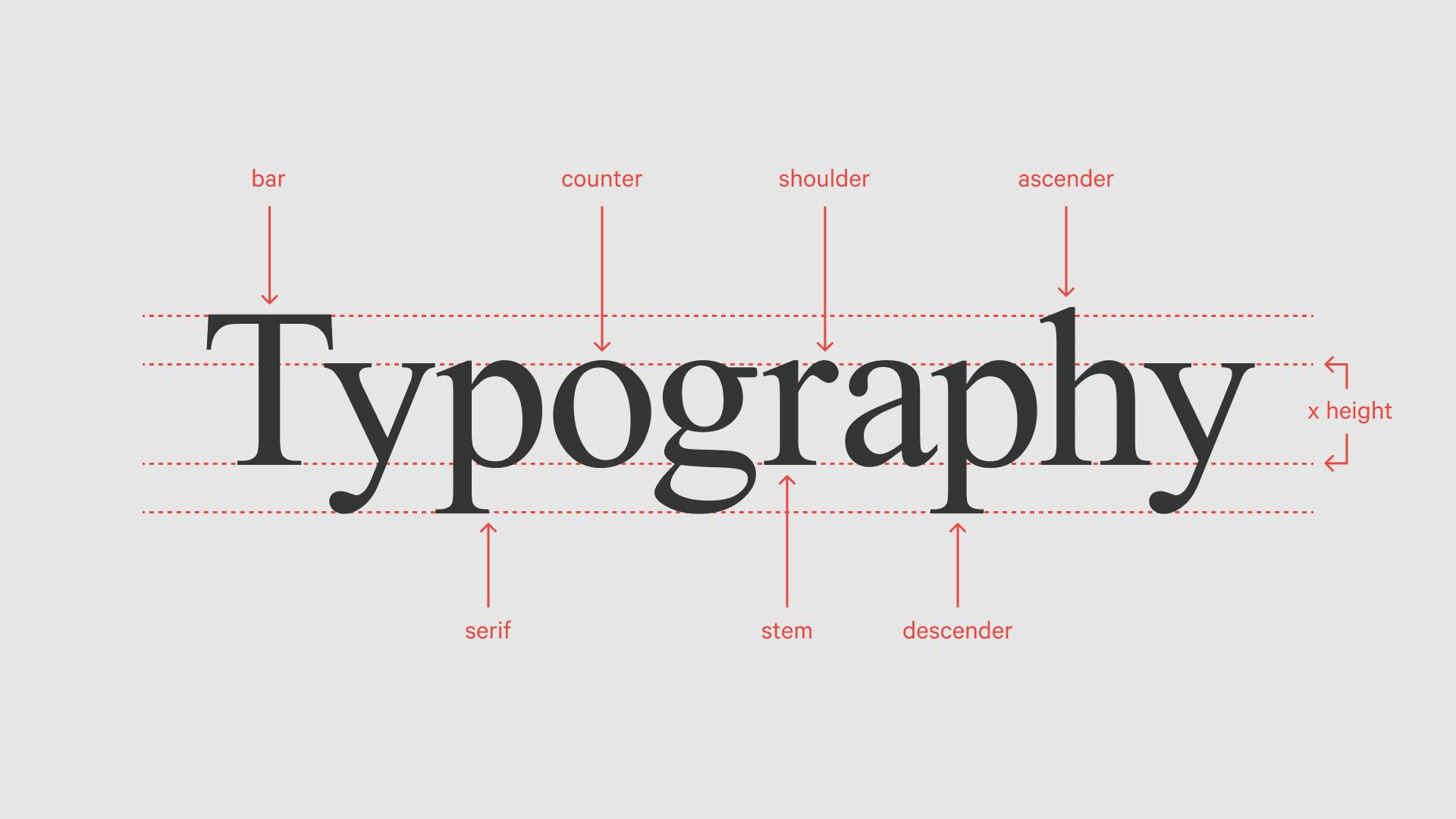
HOW OT PICK A FONT
Selecting a font might seem as simple as picking a name from a dropdown menu, but choosing the right font is often one of the most thoughtful and critical decisions in the design process. Traditionally, graphic designers learn typography basics through the lens of print design. However, with design now extending into countless digital platforms, typography and font design has become an even more complex challenge.
However we broke down 6 simple rules to format typefaces for optimal readability and user experience.
TABLE OF CONTENTS
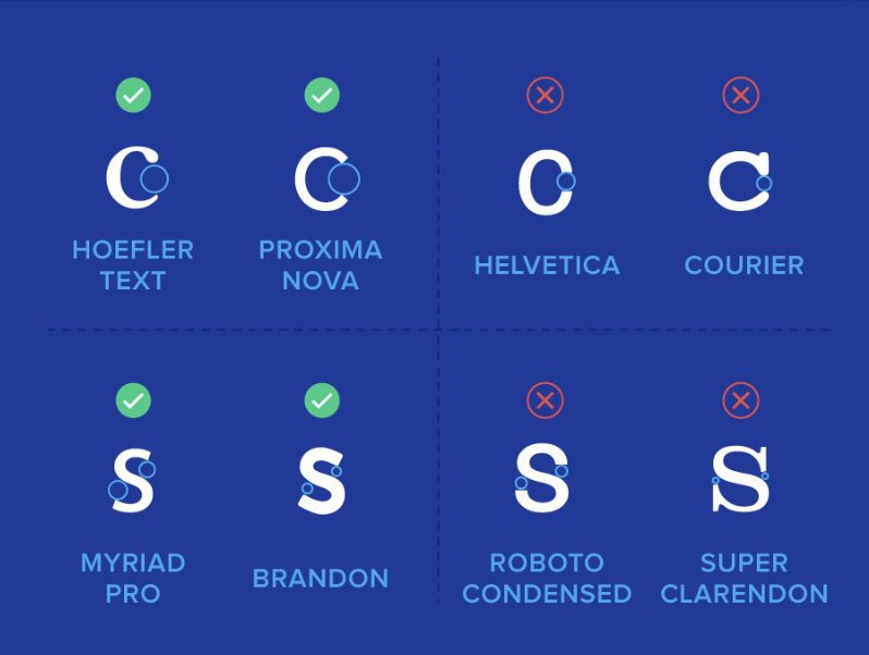
Open letters
Letters that are open are less likely to blur or distort across media devices
Avoid repetition
Letters that have repeating formats are harder to read and should be avoided. Each letter should have a distinct shape.
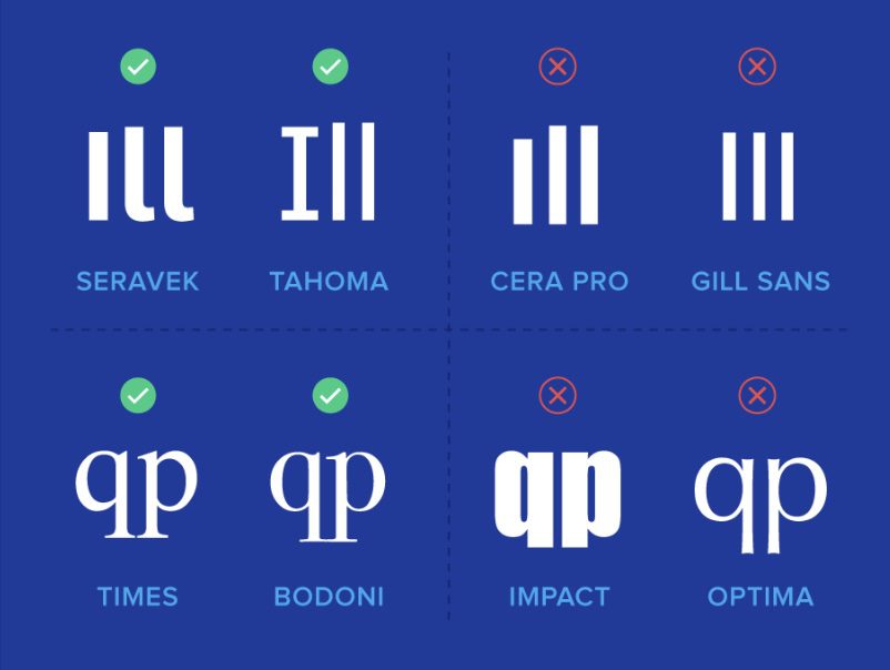
Clear start and end
Letters should have a clear start and end for eye to recognise individual forms, especilly on similar letters llike i and l and t and f.
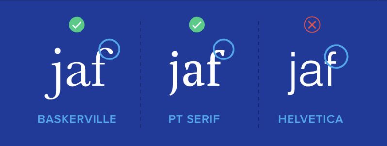
Contrast / Font Weight
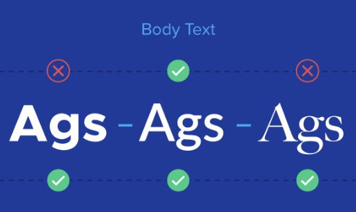
Body text needs some stroke form, but to large or small and it overlaps or creates an arduous task to read. Keep the font weight in the mid range.
Font size
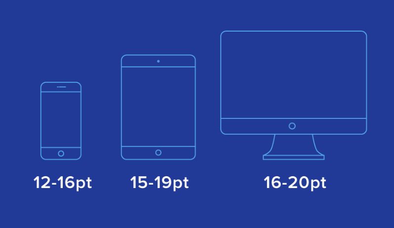
size depends on the device so a responsive font is needed to display easy reading sizes across devices. A font should not be set at a certain px as it will look too small or big on other devices.
content width
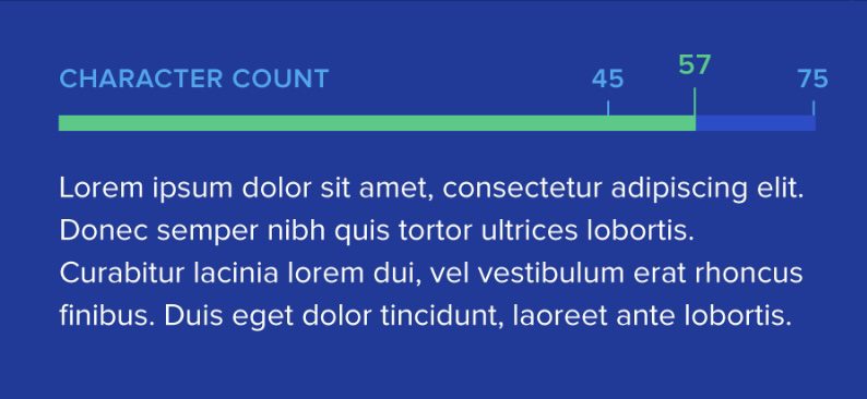
most websites use a left and right column, so splitting an A4 piece of paper in 2. To avoid reader fatigue a recommendation of 45 – 75 characters is optimal.
Need Help Designing Your Website?
We are an Auckland based design studio helping small NZ businesses achieve growth online. Look over our options for web design or view our client portfolio to see how we can get your website generating the leads you need!


